Design, Development & Branding
Website Redesign Checklist for Australian Businesses: 12 Signs It’s Time to Upgrade
1 September 2026
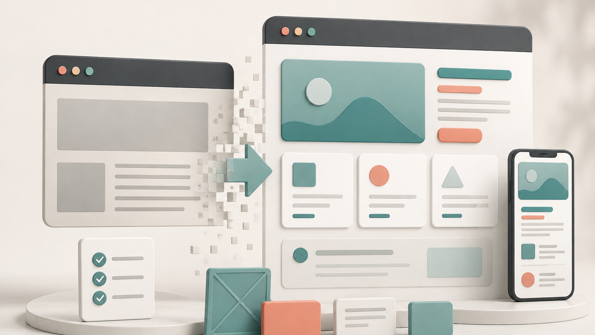
A website redesign is worth considering when your current site no longer explains your value clearly, supports the way customers now buy from you or gives your team confidence to send people there. A new look alone is rarely a good reason to rebuild. The stronger reason is that the existing website is creating friction: it confuses visitors, produces low-quality enquiries, is difficult to update or no longer represents the business you have become.
For Australian businesses, this matters whether you sell locally, nationally or across several states. Prospects will often compare providers before contacting anyone. If your site is slow, vague, inconsistent or hard to use on mobile, they may decide you are not the right fit before you have had the chance to speak with them.
Use this checklist to decide whether you need a focused improvement, a strategic refresh or a full website redesign.
Start with the real question: is the website helping the business move forward?
The most useful redesign conversations are not about whether the website feels old. They are about whether it supports a real business objective.
Perhaps the business has introduced a higher-value service, moved into new markets, changed its ideal customer or grown beyond the capabilities of a basic template site. Perhaps the sales team keeps explaining information that should be clear online. Or perhaps traffic is coming in, but enquiries are inconsistent and the team cannot see why.
Before choosing a platform, colour palette or homepage layout, write down what the new website needs to achieve. Examples include:
- Generate more qualified enquiries for a specific service.
- Explain a complex offer in a way non-experts can understand.
- Support a national customer base while still making service areas clear.
- Build credibility before a prospect books a call.
- Make it easier for the team to publish case studies, insights or landing pages.
- Connect forms and lead data to a CRM without manual copying.
- Reduce the number of questions that delay a sales decision.
If you cannot name the job the website must do, a redesign can quickly become a subjective exercise. A clear objective gives every later decision a useful test: does this change make it easier for the right customer to understand, trust or act?
12 signs your current website may be costing you opportunities
1. Visitors cannot quickly tell what you do
The opening section of a homepage should make three things clear: who you help, what you help them achieve and what action to take next. If the headline relies on broad claims such as “innovative solutions” or “quality service” without explaining the offer, visitors must work too hard to understand the business.
Review the first screen on both desktop and mobile. Can someone unfamiliar with your company accurately describe the service after ten seconds? If not, the problem is likely positioning and content hierarchy before it is visual design.
2. Your services have changed, but the website has not
Many businesses outgrow their original site quietly. New services are added as a paragraph to an old page. A specialist offer is buried in a menu. The team has moved upmarket, but the website still speaks to a different kind of customer.
A redesign is often justified when the site no longer mirrors the real commercial model. The new structure should reflect how customers evaluate your services today, not how the business was described three years ago.
3. The site looks credible, but it does not create a clear next step
Beautiful layouts do not automatically convert. A prospect still needs to know what happens after they click, call or submit a form. If your calls to action are inconsistent—“learn more” on one page, “contact us” on another, no next step on a third—visitors may leave without taking action.
Good conversion design uses calls to action that match the level of intent. A person learning about your service may want to see a relevant case study. A person comparing suppliers may be ready to request a proposal or book a discovery call.
4. Mobile users have a second-class experience
For many service businesses, a meaningful share of research and enquiries happens on a phone. Common problems include tiny text, crowded menus, forms that are difficult to complete, slow image-heavy pages and buttons that are too close together.
Do not assess mobile by shrinking a desktop browser window. Test the important actions on actual devices: read a service page, find contact details, submit an enquiry and open a case study. If the path feels awkward to you, it will feel worse to a busy prospect.
5. Your pages answer internal questions, not customer questions
An internal team knows its language, systems and service categories. A customer may not. When web copy is organised only around internal departments or technical labels, it can obscure the outcomes customers care about.
Strong service pages begin with the problem or result the buyer recognises. They then explain the method, scope, process, proof and next step in clear language. Technical detail still has a place; it just needs context.
6. It is difficult to publish or update important content
If every simple update requires a developer, essential information becomes stale. Pricing guidance, service areas, team profiles, case studies and blog articles are then delayed or avoided altogether.
The answer is not necessarily a more complicated content management system. It is a sensible content model: reusable page sections, clear fields, permissions that match your team and a simple process for quality control.
7. Leads arrive, but the team lacks the information needed to respond well
A vague “contact us” form may produce messages, but it gives the team little context. The result is slower qualification, unnecessary back-and-forth and poor visibility over lead sources.
An effective enquiry flow captures only the information needed to route and respond to the lead well. It can also identify the service of interest, referral source and preferred contact method, then send that information into the CRM or sales workflow.
8. Important trust signals are missing or hard to find
Prospective customers want evidence before they commit. Depending on the business, this might include project examples, testimonials, certifications, team expertise, process clarity, locations served, delivery timeframes or answers to common concerns.
Trust should not be an afterthought at the bottom of one page. Place the proof near the decisions it supports. For example, a customer considering a complex project may need to see how you work before they are ready to enquire.
9. The website is not built around your highest-value opportunities
Every service does not need equal prominence. If one service is strategically important, profitable or growing quickly, it needs a clear page, a compelling proposition and a strong conversion path.
A redesign lets you prioritise the work you want more of. That may mean creating dedicated service pages, comparison content, industry pages, lead magnets or case studies around the customers you most want to attract.
10. Search visibility is limited because the site structure is unclear
Search engines and AI-powered search experiences need the same thing users do: clear, useful information about what each page covers and how pages relate to one another. A site with duplicated headings, thin service pages, hidden navigation or unclear internal links makes that harder.
The redesign should include a content and technical foundation: descriptive page titles, logical heading hierarchy, crawlable links, accurate metadata, useful internal linking and original content that demonstrates genuine expertise. Do not treat search optimisation as a final plug-in after the pages are built.
11. The design is inconsistent across channels
Your website, proposals, social posts and sales materials should feel like the same business. When each piece uses different colours, fonts, messages and levels of polish, customers may question whether the business is established or reliable.
A brand system solves this by giving the team practical rules for visual identity, type, colour, imagery and voice. It makes future work faster while improving recognition and consistency.
12. You are embarrassed to send prospects to the site
This is not a technical metric, but it is a useful signal. If your sales team avoids linking to the website, apologises for it or creates separate documents to explain the offer, the site is no longer acting as a sales asset. It is time to understand why.
A redesign does not always mean starting from zero
There are three common responses to a weak website:
Targeted optimisation
This is the right approach when the brand, platform and core structure are sound, but one or two conversion paths are weak. The work may focus on copy, CTA placement, forms, mobile layouts and key landing pages.
Strategic refresh
Choose a refresh when the offer is still broadly right, but the visual system, navigation or priority pages need improvement. Typical work includes updating brand elements, reorganising pages and improving the highest-value templates.
Full redesign
A full redesign is more appropriate when the business, audience, technology or positioning has materially changed. It reworks the strategy, site architecture, brand system, content and development foundation together.
Choosing the smallest solution that fixes the actual problem is often better than committing to a full rebuild too early. On the other hand, endless patching is expensive when the site’s structure is fundamentally wrong.

What a well-scoped redesign process should include
A quality website project has more than a design phase. It should bring together the decisions that shape performance after launch:
- Discovery: Understand the business, target audience, sales process, competitors, priorities and current website performance.
- Positioning and messaging: Define the value proposition, proof points, terminology and page-level calls to action.
- Information architecture: Map the pages, navigation and internal links around the questions customers need answered.
- Content plan: Decide what existing material can be retained, what needs rewriting and which evidence is missing.
- UX and visual design: Create a responsive experience that is clear, accessible and recognisably on brand.
- Development and integration: Build a maintainable site, connect forms and relevant systems, and protect the essential technical SEO foundations.
- Quality assurance and launch: Test links, forms, tracking, accessibility basics, mobile journeys and redirects from any pages being replaced.
- Post-launch improvement: Watch actual enquiries and user behaviour, then refine the pages that matter most.
When a redesign combines these disciplines, it becomes a business project rather than a cosmetic upgrade. AIECOMSolutions provides website design and branding services for Australian businesses that need their online presence to make the offer clearer, strengthen trust and create a more useful path to enquiry.
Website redesign planning checklist
Before requesting quotes or starting a project, gather the following:
- Your current website URL and a list of pages you want to keep, remove or improve.
- The services, products or customer types you want to grow.
- Examples of customer questions, sales objections and common reasons people choose you.
- Existing brand assets, photography, case studies, reviews and credentials.
- Analytics and lead data, where available.
- The software that must connect to the site, such as a CRM, booking tool, ecommerce platform or email system.
- A realistic internal decision-maker and content-review process.
- Your preferred launch window and any business milestones it needs to support.
The next step
Your website should make your business easier to understand, easier to trust and easier to choose. If it is not doing that, begin with a diagnosis of the customer journey and the commercial opportunity not a list of visual preferences.
The best redesigns give your team a clearer story to tell and your customers a simpler way to take action.
NEXT STEP
Ready to Work With a Team That Actually Delivers?
Book a free strategy call. No pitch. Just honest advice.